Scatter graph method
Definition and explanation
Scatter graph method is a visual representation used to divide fixed and variable cost components from a mixed cost figure. This is done by plotting the points at which the cost on one axis and activity on another axis meet to find out the correlation between these two variable.
Scatter graph method makes use of a graphical representation of ‘mixed cost’ of a company and the activity levels which affect this cost or due to which this cost is incurred. The activity levels of the business is usually marked upon the horizontal axis (i.e., x-axis) and the attached costs on the vertical axis (i..e., y-axis). A regression line is then drawn to match the points at which these two variables meet.
Like high-low point method and least squares regression method of mixed cost analysis, scatter graph method follows the following cost function:
y = a + bx
Where:
- y = total cost
- a = total fixed cost
- b = variable cost units
- x = activity level
Steps involved in analysis of mixed cost using scatter graph method:
- Different points are marked on the graph for the costs incurred at different activity levels. The x-axis is usually used for activity and y-axis for costs.
- A regression line is carefully drawn to match the data points to find out the relationship between the two variables. Try should be made to minimize the vertical distance between the data points and the regression line while drawing the line through visual inspection. For mixed cost, the line will usually start from an upper point on y-axis rather than from the pivot point which would indicate the presence of fixed cost element. The slope or upward slant of the line shows a gradual increase in the cost with increasing activity level. It indicates the presence of variable cost element in the total cost.
- After determining the total fixed cost in step 2, the slope of the regression line (i.e., variable cost per unit) is calculated by using two points (x1, y1) and (x2, y2) on the line. The formula to find per unit variable cost can be written as follows:

Example
The Cannon Company provides you the following overhead cost data for eight production runs.
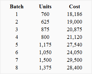
Required: Determine the cost function from the data provided by Cannon Company using scatter graph method of mixed cost analysis.
Solution
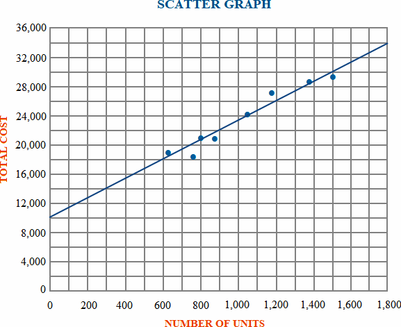
For the above scatter graph, the activity level or production in units is presented on x-axis and the related costs are presented on y-axis. A regression line is drawn which extends from left to right to show an increase in cost as the level of activity increases.
As can be seen the costs are not plotted from ‘O’ the pivot point, but from an upper point, which shows that at zero activity level there exists a cost of $10,000. This is the point where regression line cuts y-axis and which represents the total fixed cost of $10,000. The slop of the regression line (i.e., variable cost per unit) can be found out as follows:
Variable cost per unit = (y2 – y1)/(x2 – x1)
= (34,000 – 10,000)/(1,800 – 0)
= 24,000/1,800
= $13.33
The cost function on the basis of data provided by Cannon Company is as follows:
y = $10,000 + $13.33x
Limitations:
The results obtained from scatter graph approach are not ideal. The main reasons for this are as follows:
- The line or curve plotted on the graph only shows an estimate of the cost which may or may not be close to the real cost.
- This method cannot be used to estimate the segregation of mixed cost where step-costing (the increase in the level of fixed cost after a certain level) is used.
It is so interesting to know details about costs and plotting them.